A Problem–Result Framework for Business Clarity and Decision-Making
Abstract
Modern marketing operates in an environment of information overload, shrinking attention spans, and rising buyer skepticism. Traditional text-heavy explanations often increase cognitive effort rather than reduce it, leading to disengagement and delayed decisions. This blog presents a research-driven analysis of comparative visuals—specifically Problem vs Result representations—as an effective mechanism for reducing cognitive load and improving clarity in marketing communication. By integrating principles from cognitive psychology, visual perception, and applied business practice, this paper outlines a structured framework for designing comparative visuals that clearly communicate transformation, accelerate understanding, and support confident decision-making.
1. Introduction
Marketing today is no longer constrained by access to information, but by the human capacity to process it. Buyers are exposed to:
Multiple tools and platforms
Repetitive claims and promises
Complex service explanations
Under these conditions, excessive information increases friction. What buyers seek instead is clarity.
Comparative visuals address this challenge by placing the current state and future state side by side, enabling immediate comprehension. This blog argues that comparative visuals are not merely creative assets, but strategic instruments for cognitive efficiency in marketing.
2. Cognitive Load in Marketing Communication
2.1 Cognitive Load Theory
Cognitive Load Theory states that the human brain has a limited capacity for processing new information. When marketing content exceeds this capacity, comprehension drops and decision-making slows.
Text-heavy or abstract messaging often:
Requires interpretation
Demands memory recall
Increases mental effort
Comparative visuals reduce this burden by externalizing comparison, allowing the brain to process differences visually rather than analytically.
2.2 The Role of Visual Contrast
Human perception is inherently contrast-driven. We do not evaluate conditions in isolation; we understand them relative to alternatives.
Comparative visuals leverage this by:
Making inefficiencies visible
Highlighting improvement without explanation
Reducing the need for persuasive language
The brain recognizes difference faster than description.
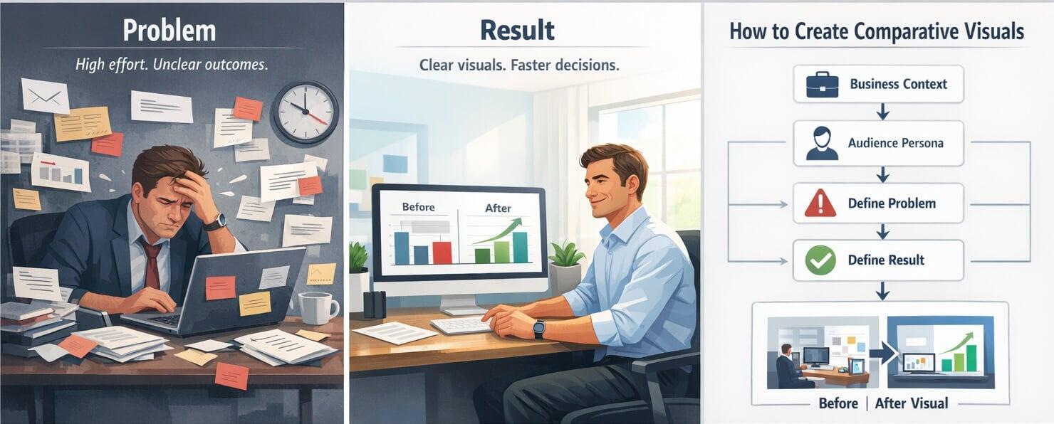
3. The Problem–Result Comparative Framework
At the center of effective comparative visuals lies a simple but powerful structure:
⬅️ Problem (Before) | ➡️ Result (After)
This framework represents two states of the same audience persona.
| Dimension | Problem State | Result State |
|---|---|---|
| Mental State | Confused, overloaded | Confident, clear |
| Effort | Manual, repetitive | Optimized, structured |
| Tools | Many, disconnected | Few, integrated |
| Time | High consumption | Faster execution |
| Outcomes | Unclear, inconsistent | Predictable, visible |
The strength of the framework lies in continuity—the same person, transformed.
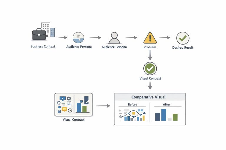
4. Methodology: Designing Comparative Visuals
4.1 Defining Business Context
Effective visuals must be grounded in a clearly defined business context:
Business category and sub-category
Nature of service or offering
Audience maturity (beginner, growing, scaling)
Primary objective (clarity, adoption, conversion)
Without context, visuals become generic and fail to resonate.
4.2 Audience Modeling
The audience must be understood across four dimensions:
Demographic: age, income, education
Geographic: market type, region, operating environment
Psychographic: values, aspirations, mindset
Behavioral: buying habits, urgency, tool usage
This ensures the problem state feels familiar and the result state feels attainable.
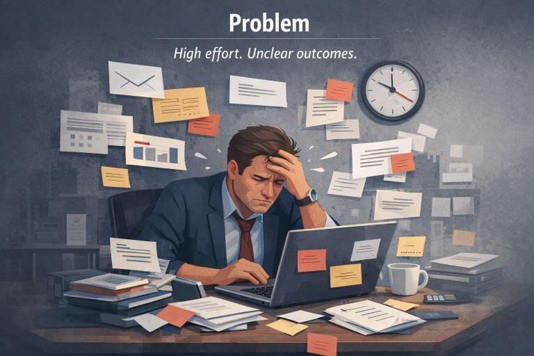
5. Constructing the Problem State (Left Side)
The problem side should reflect current operational reality, not exaggerated failure.
Key Characteristics:
Tool overload
Manual coordination
Delayed outcomes
Lack of visibility
Dependency on external support
Visual Language:
Messy screens and dashboards
Multiple tabs and notifications
Scattered notes and emails
Time pressure indicators
On-image text should describe the condition, not hint at the solution.

6. Constructing the Result State (Right Side)
The result side visualizes controlled improvement, not perfection.
Key Characteristics:
Structured systems
Clear outputs
Reduced effort
Faster execution
Confident decision-making
Visual Language:
Clean interfaces
Simplified workflows
Focused, calm professionals
Clear and minimal outputs
This creates a sense of relief and control—critical emotional signals for buyers.
7. Mood, Style, and Aesthetics
Design plays a cognitive role, not just an aesthetic one.
Mood Engineering
Before: stress, overload, uncertainty
After: clarity, confidence, relief
Structural Style
Split-screen comparison
Linear transformation flow
Balanced visual hierarchy
Aesthetic Principles
Limited color palette
High contrast between states
Minimal text
Intentional whitespace
Good design reduces noise and supports faster understanding.
8. Application Across Marketing Channels
Comparative visuals are effective across:
Website hero sections and landing pages
WhatsApp marketing and broadcasts
LinkedIn posts and carousels
Sales decks and proposals
Workshops, training, and webinars
They are especially powerful in early-stage buyer education, where clarity determines engagement.
9. Evaluation and Impact
Organizations using comparative visuals often observe:
Reduced explanation time in sales conversations
Higher engagement and recall
Faster decision cycles
Improved lead quality
Stronger trust signals
These visuals function as pre-alignment tools, preparing buyers before human interaction.
10. Discussion
Comparative visuals succeed not because they persuade aggressively, but because they remove ambiguity. By reducing cognitive effort, they allow buyers to focus on relevance rather than interpretation.
The research indicates that:
Clear problem definition amplifies perceived value
Realistic results build credibility
Visual contrast accelerates trust formation
11. Conclusion
Marketing effectiveness today depends less on how much is communicated and more on how easily it is understood.
Comparative visuals, when designed using a structured Problem–Result framework, significantly reduce cognitive load and improve decision confidence. They transform marketing from persuasion-driven messaging to clarity-driven communication.
In crowded markets, clarity is not a creative advantage—it is a strategic one.
Key Insight
If the problem is not clearly visualized, the result will never feel meaningful.
Comparative visuals work because they make transformation visible—quickly, honestly, and convincingly.